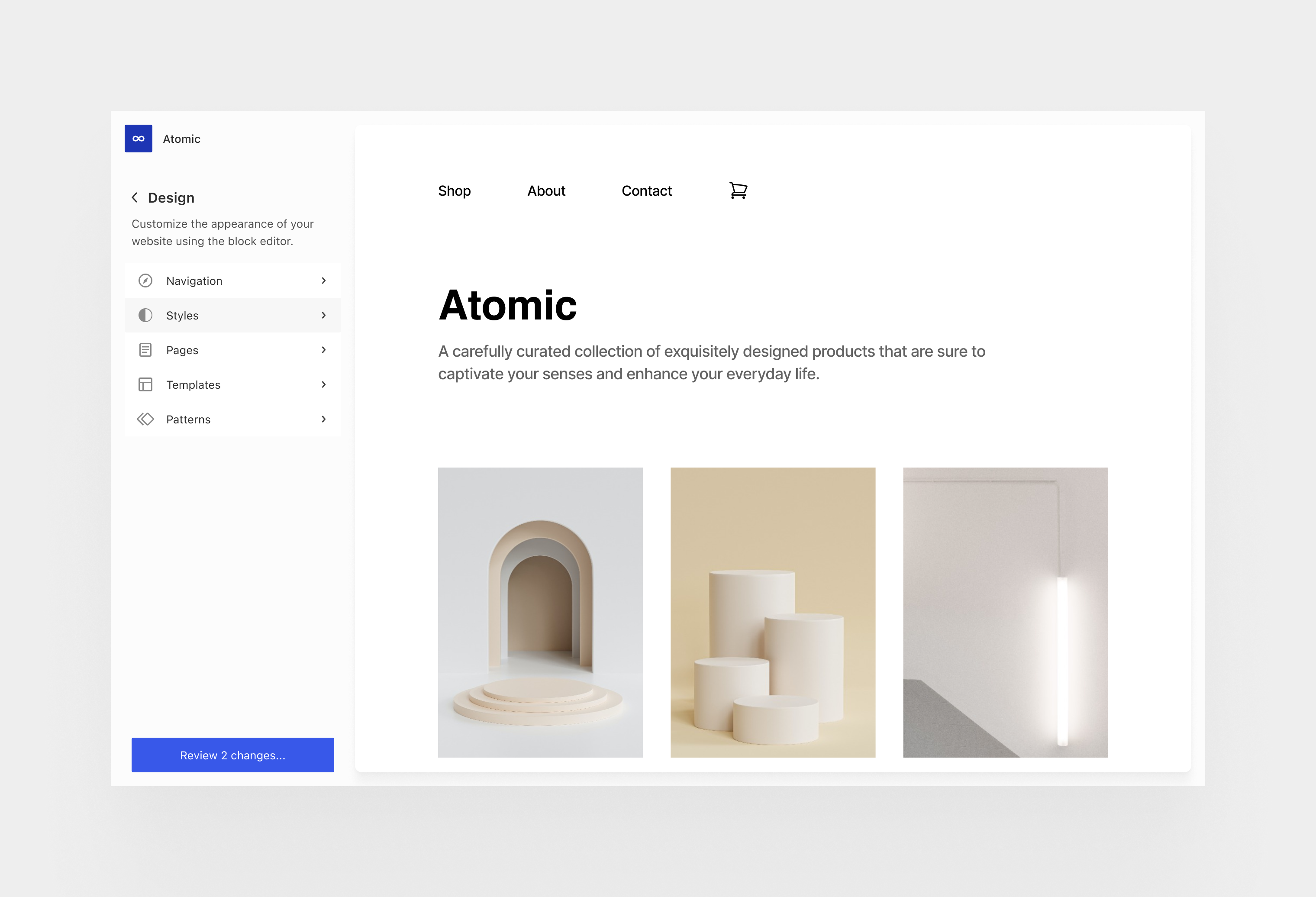
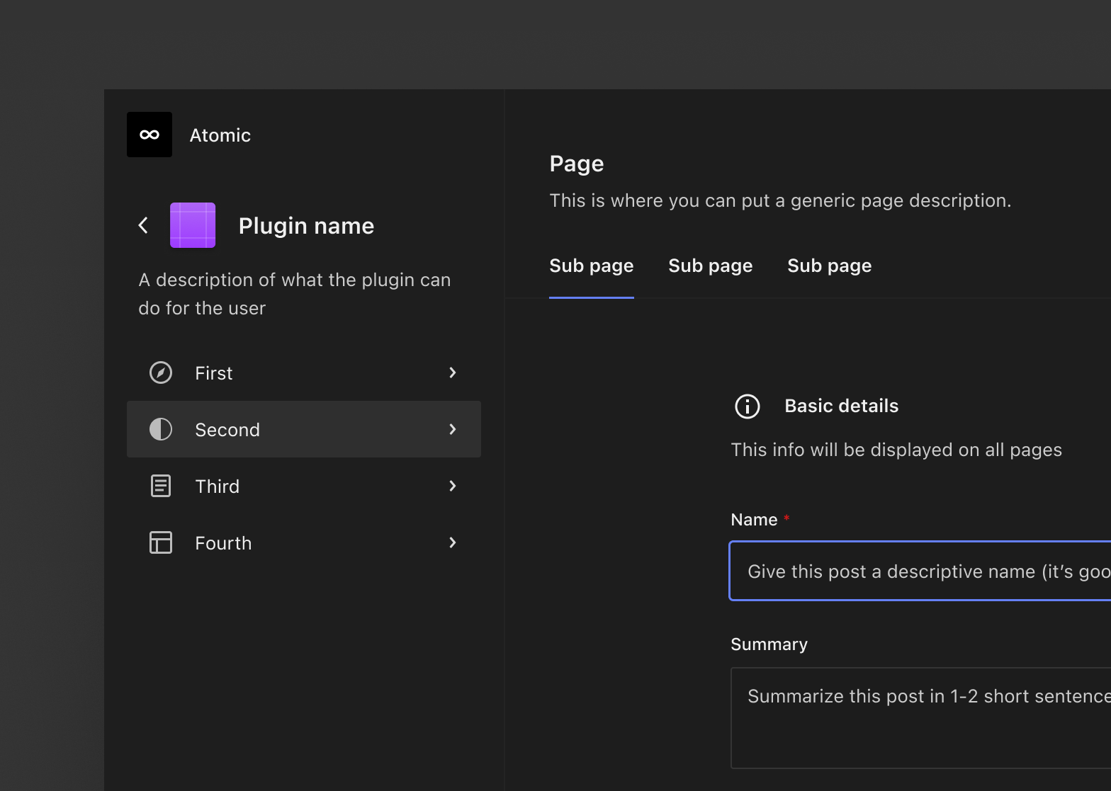
WordPress’ admin is on deck for a long-awaited makeover after Gutenberg lead architect Matías Ventura published plans for a revamped admin design as part of the Phase 3: Collaboration road map.
“As WordPress turns twenty years old, the overall aim of this work is to improve upon this experience at a foundational design level, giving plugins and users more control over the navigation while ensuring each WordPress experience is recognizable, intuitive, accessible, and delightful,” Ventura said.
His post is a follow-up to some earlier admin concepts he published a year ago which evolves the admin towards more fluid browsing and editing flows. This is similar to the block editor design that positions the admin frame as a shell that wraps around a canvas that contains the content in a zoomed state. Instead of users clicking back to access navigation tools, the tools remain present but outside of the canvas view.
Although contributors have not yet officially produced any designs for the project, Ventura shared a light version of an admin concept.

One aspect of the proposed plans that has energized the developer community is the prospect of the admin getting rebuilt with an extensible design system.
“This effort is also an opportunity to formalize the design primitives and interaction paradigms that are part of the UI component system begun in wordpress/components,” Ventura said.
“A crucial aspect is to ensure WordPress itself is built with the same pieces and APIs that plugin authors can use. Aside from color themes, our set of primitive components also need to work in dense environments like the editor, as well as environments that need more breathing room and focus like admin sections. Density, clarity, usability, and accessibility are paramount.”

The admin design concepts have renewed developers’ excitement about the future of WordPress, but they are also hoping this revamp will solve several long-standing problems with the interface.
One recurring theme in the feedback was the need to find a way to curb the pollution of top-level menus and the out of control admin notices, which are hijacked by plugin developers in the absence of a standard notification system.
“It’s really about aligning APIs, ensuring we have semantic descriptions of capabilities, and offering the right levels of controls for both plugins and users,” Ventura said.
“I know it’s a fairly limited example, but there’s a nice balance in the ability to pin or unpin plugin sidebars on the editor, from the perspective that plugins can be opinionated, and users can still interact with those opinions.”
Another challenge that concerns developers is ensuring the new design adequately accommodates WordPress sites with large numbers of posts, pages, categories, menus, comments, and other things that can easily overwhelm a UI that was intended to be simplified.
“As part of leveraging the components across the admin interface, we need to address functional gaps (like table and list views, bulk editing operations, etc) and assist plugin needs for anything that might not be already addressed that should be addressed,” Ventura said. “Ultimately, the design library needs to be showcased in the wordpress.org website as a clear resource for people building upon WordPress.”
Developers who participated in the comments were optimistic about the project and reacted positively to the concepts Ventura shared.
“I often say, white space is where the magic happens,” WordPress designer and developer Brian Gardner said.
“The light admin concept is breathtaking and gets me even more excited than I am now about the future of WordPress.”
Several developers commented on how eagerly they are awaiting an update to a modern UI that reduces the number of page refreshes.
“Wow! It’s gonna be amazing!” WPMarmite founder Alex Borto said. “A complete admin fluid browsing experience is much needed. I dream of navigating through the admin area without any page loads!”
For years, WordPress developers have been expected to try to match WordPress’ dated admin UI on their settings pages and the Yoast SEO plugin drew criticism when it released version 20.0 with a new modern interface. Many users are not keen on plugins building their own UI in the admin, as it can make things more confusing. Having a standard set of UI components would make things easier for developers who are extending WordPress.
“This gives me great optimism about securing the next 20 years of WordPress’s success,” WordPress developer Mike McAlister said. “The fact that you can do anything with WordPress is incredible, it’s probably our biggest strength.
“But without standardized design patterns for the admin, we’ve seen that devolve into a UI/UX headache with plugin and theme developers baking their own experiences inside WordPress. Reining this in and creating a unified experience for everyone to buy into will not only make it easier on product creators, it will also be a huge win for users.”
Ventura said this document is just an outline of the admin design project and that it will be followed up with more in-depth design explorations further down the road.
WP Tavern


Leave a Reply
You must be logged in to post a comment.