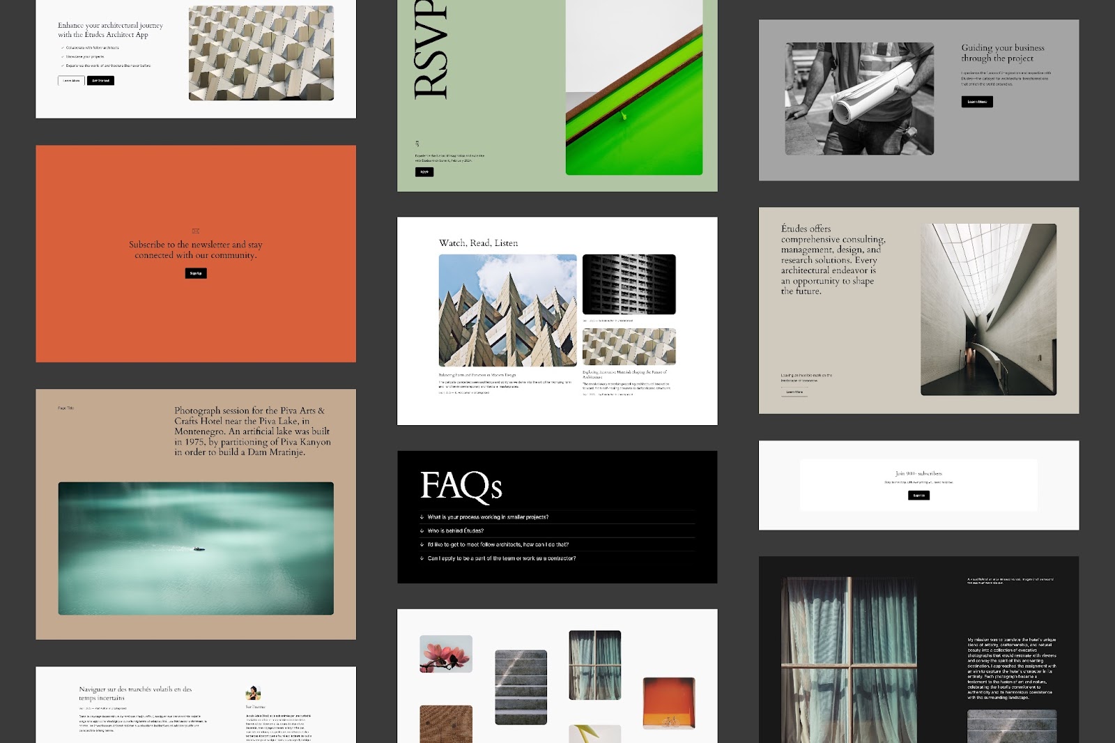
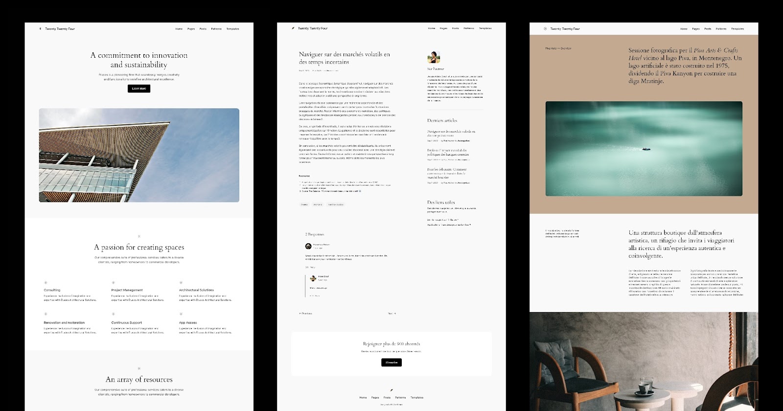
WordPress 6.4 will be shipping with a new default theme, expected in early November. The theme’s project leaders unveiled the designs and concept for Twenty Twenty-Four in an announcement on WordPress.org today.
For those who have complained that past default themes have been too niche or too narrowly focused in design, this theme will take the reverse approach. Contributors are attempting to build the ultimate multi-purpose theme that can be used for nearly any kind of website, highlighting the unmatched flexibility of building with blocks.

“The idea behind Twenty Twenty-Four is to make a default theme that can be used on any type of site, with any topic,” core contributorJessica Lyschik said. “Because of that, and contrary to past years, it has no single topic. Instead, three use cases were explored: one more tailored for entrepreneurs and small businesses, one tailored for photographers and artists and one specifically tailored for writers and bloggers.”
Last year’s default theme, Twenty Twenty-Three, was a stripped-back and minimal version of Twenty Twenty-Two, with a strong focus on community-submitted style variations. Like its predecessor, Twenty Twenty-Four will put the spotlight on some of the latest WordPress design features.
“Twenty Twenty-Four will be a block theme fully compatible with all the site editor tooling and it will surface new design tools like the details block or vertical text,” Lyschik said. “Another key intent for the theme is to properly present whole page patterns and template variations so that users don’t need to assemble whole pages themselves, thus easing up their site building process.”

Whole page patterns are a critical feature that all of the best block themes provide, as most people feel daunted when starting from a blank slate. If a whole page pattern is already pre-inserted on a new website install, users are light years ahead in their site building efforts.
Twenty Twenty-Four features the Cardo font for headings and a sans-serif system font for paragraph text. Cardo is an Old Style serif typeface designed by David J. Perry in 2002 for “classicists, biblical scholars, medievalists, and linguists.” It grounds the design with a bit of sophistication but should be easy to swap out with the typography management features coming in 6.4.
The initial previews of the theme don’t stray far from many of the traditional website designs you might see browsing businesses or portfolios. It leans more towards providing an invisible framework for the user’s own creations, instead of pushing a single, opinionated design. This design lets the Site Editor and design controls shine as tools that can unlock human creativity on the screen. So far it has received positive feedback on the WordPress.org announcement. Check out the post for more images/video, and information on how contribute to Twenty Twenty-Four’s development.
WP Tavern


Leave a Reply
You must be logged in to post a comment.